FinTech
Design System
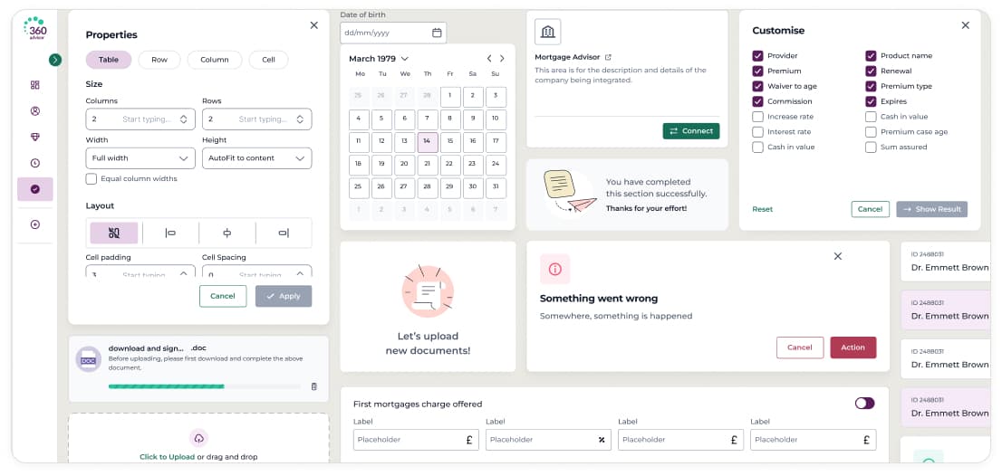
Built a 38-page component library from scratch. It gave the team a shared set of patterns to build from, rather than each module going its own way.
See the systemShipped & stable

Four years working across a complex fintech platform, improving the product piece by piece.
The product and the problem
360 Advisor is a CRM platform for UK financial advisers. It had grown feature by feature over several years within established workflows and technical constraints. By the time I joined, patterns had drifted between modules, there was no shared design language, and some core workflows had become complex and inconsistent over time.
Over four years, I worked across several parts of the product alongside two business analysts, five developers, and two managers. The work ranged from building a design system to improving individual workflows, forms, dashboards, and mobile screens. Each area is covered in a separate case study below.
Five areas of the product, each with different constraints, different problems, and different levels of ownership.
Not sure where to start? Start with the Design System.
Built a 38-page component library from scratch. It gave the team a shared set of patterns to build from, rather than each module going its own way.
See the systemShipped & stable
The FactFind is the core data collection workflow advisers use with every client. It spans 30+ fields across several sections. The existing version had grown inconsistent and difficult to navigate.
See the redesignShipped & stable
Without analytics, I built a structured audit across 7 heuristic categories to identify and prioritise mobile improvements. It produced a documented roadmap where there had been none.
See the auditStill evolving
Rather than designing one-off dashboards for each report, I introduced reusable chart modules that could be configured per view. This made it easier to extend MI reporting without starting from scratch each time.
See the widgetsStill evolving
Lead tracking had previously been managed in spreadsheets outside the platform. This work introduced a visual pipeline so advisers could see where each prospect was and what needed to happen next.
See the pipelineStill evolving
Working within constraints
When data isn't available, good design still needs a clear reason behind it.
Without access to analytics or A/B testing, I relied on structured heuristic audits to identify problems and prioritise improvements. I covered seven categories: visual consistency, navigation, forms, mobile optimisation, status feedback, screen-specific issues, and quick wins.
This approach gave the team something concrete to plan around. It turned scattered feedback into a documented, prioritised list of improvements.
A shared design language that gave new product work a consistent foundation.
38-PAGE LIBRARY · 20+ COMPONENT SETS
More consistent patterns across five core FactFind sections.
5 FactFind sections in production
A clear mobile improvement roadmap, built without any analytics access.
7 audit categories · 42 recommendations