
Management Information & DashboardsManagement Information Charts
& Dashboards
A modular reporting system for complex management information dashboards.
The Problem
The problem
Management Information reports were built as one-off interfaces, which meant repeated design and development work. Advisers and compliance teams needed different views across portfolios, risk profiles and regulatory metrics, but each new request often meant designing similar patterns again.
THE DECISION
I designed a modular reporting system built around reusable chart, table and data patterns, allowing new reports to be assembled without starting from scratch.
THE OUTCOME
The modular system is now in production and actively used. New reports can reuse existing components and patterns, reducing the need to create custom reporting UI each time.
The Modular System
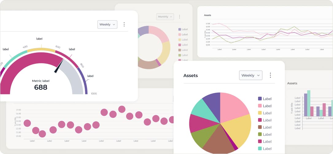
The system includes reusable components for financial data visualisation, including bar charts, line graphs, progress meters, KPI cards, comparison tables and trend views. These components are designed to be reused across reports, with consistent interaction patterns and support for different levels of data density.
A selection of modular reporting components from the system, covering bar charts, line graphs, KPI cards, and pipeline metrics.
All screens use test data.
The Modular System
The system includes reusable components for financial data visualisation, including bar charts, line graphs, progress meters, KPI cards, comparison tables and trend views. These components are designed to be reused across reports, with consistent interaction patterns and support for different levels of data density.
A selection of modular reporting components from the system, covering bar charts, line graphs, KPI cards, and pipeline metrics.
All screens use test data.
Modular Reporting System
The system is organised around information density and interaction complexity, allowing the same patterns to support anything from simple KPI views to detailed financial reporting.

Reusable Components
Components use shared inputs, states and spacing patterns, making reports easier to assemble without creating one-off layouts.

Consistent Interaction Patterns
Common interactions such as hover states, drill-down, filtering and export behave consistently across different report types.

Different Data Density
Components support different levels of financial data density, from high-level summaries to detailed reporting views.
Key Deliverables
New reports can be assembled from existing modular components instead of starting from scratch.
Reusable reporting components
Future reports can reuse existing UI patterns instead of rebuilding them.
6 report templates
A consistent visual language across all management reporting.
unified chart system