01
Navigation & Information Architecture
How users move between sections and understand where they are. I checked every transition path for thumb-friendly access and clear navigation.

A structured heuristic audit to identify and prioritise mobile usability issues without relying on analytics or user testing.
Built for desktop
The platform was designed desktop-first, with mobile added later. Advisers were using it on their phones, but the experience had never been systematically reviewed. With no analytics or user testing available, there was no clear picture of where mobile friction was happening or what to fix first.
THE DECISION
Without analytics or user testing, I defined a structured heuristic audit across seven UX categories. I assessed each finding by severity and translated the results into specific, prioritised recommendations.
THE OUTCOME
The audit became a practical reference for mobile improvements, turning scattered usability issues into a prioritised backlog of 42 actionable recommendations.
I defined seven categories to cover the mobile experience, each with its own criteria for assessing severity and deciding what to fix first.
How users move between sections and understand where they are. I checked every transition path for thumb-friendly access and clear navigation.
The platform's core interaction. I reviewed input types, validation patterns, and error states for mobile-specific friction such as keyboards and field sequencing.
Tap targets, swipe areas, and gesture conflicts. I applied 44px touch target guidelines and checked for overlapping hit areas in dense data views.
How information priority translates to smaller viewports. I checked that the desktop hierarchy remained clear on mobile through spacing, type scale, and content grouping.
Loading states, error messages, and success confirmations. Mobile users have less screen context, so feedback needs to be immediate and explicit.
How text-heavy desktop content adapts to mobile reading patterns. I assessed truncation logic, progressive disclosure, and whether key information remained visible.
Whether mobile views use the same components and spacing tokens as desktop, or have introduced one-off patterns that increase maintenance.
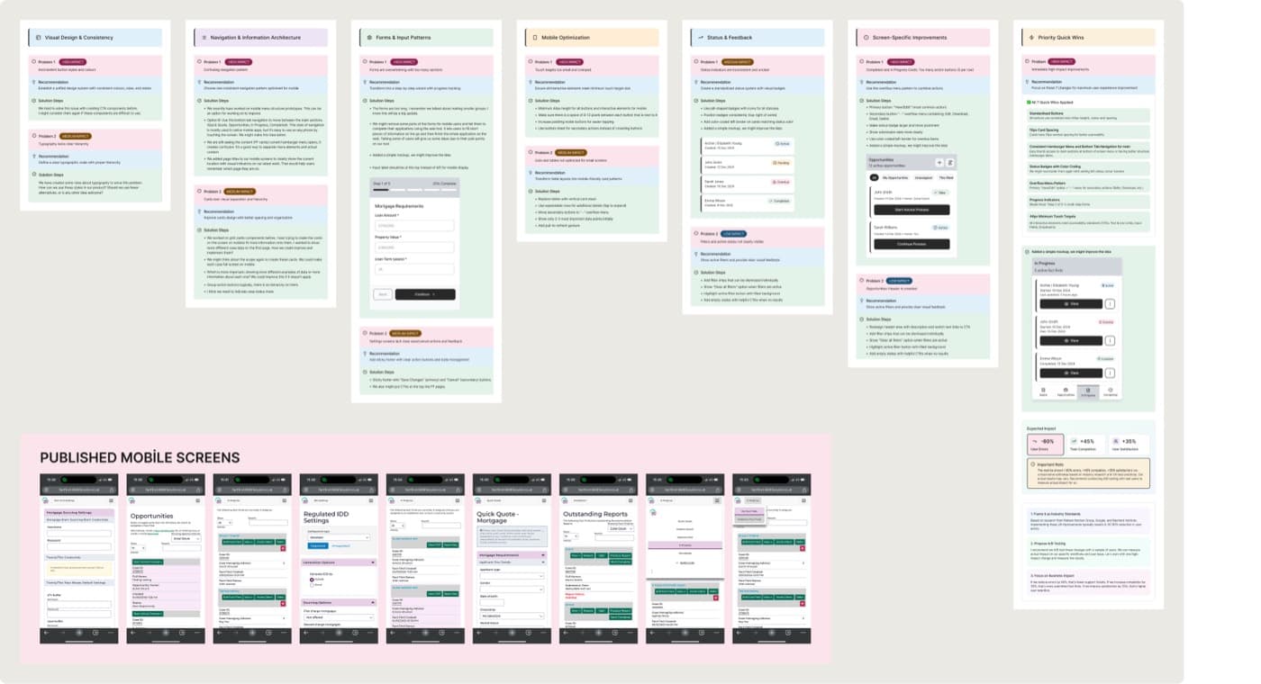
A sample page from the live audit document. Each finding includes the screen, issue, impact, severity, and recommended fix. This format gives developers enough context to act without a separate briefing.
Zoom 100 percent
Drag to move the document. Use the controls to zoom in and out.
Mobile screens analysed during the UX audit: original screenshots with annotated findings and severity ratings.
All screens use test data.
A structured way to prioritise mobile improvements without analytics.
7 AUDIT CATEGORIES
A reusable audit document for ongoing mobile decisions.
9-PAGE REPORT
A concrete, prioritised backlog for future improvements.
42 ACTIONABLE RECOMMENDATIONS