
Design System
From zero to a 38-page library used across the platform.
The Problem
Inconsistent Patterns
360 Advisor had been built feature by feature over several years. Each area solved its own problems well enough, which meant buttons, form layouts and navigation had drifted apart from one module to the next. There was no shared library to build from, so every new screen started by re-deciding something that had already been decided somewhere else.
THE DECISION
A third-party kit would have been faster. But the platform had unusual needs: dense financial data entry, compliance indicators woven into every form, multi-step workflows where a generic kit would have felt like wearing someone else's shoes. So I built a 38-page component library from scratch, shaped around how financial advisers actually work. For icons I used Heroicons rather than drawing 500 of my own, and spent that time categorising them by adviser task instead.
THE OUTCOME
The library holds 20+ component sets, structured in layers: foundations first, then base components, then composed patterns, then full flows. A colour token change cascades through all of it. That structure is the point. Consistency stops being something anyone has to check by hand and becomes a property of the system.
System Architecture
I structured the library in layers: primitives (colour, type, spacing), base components, composed patterns, then full production flows. Each layer only knows about the one below it, so a change at the bottom reaches everything above it without touching anything in between.
Foundations
General Components
Feature Components
Page Templates
Prototyped Flows
From the Actual Library
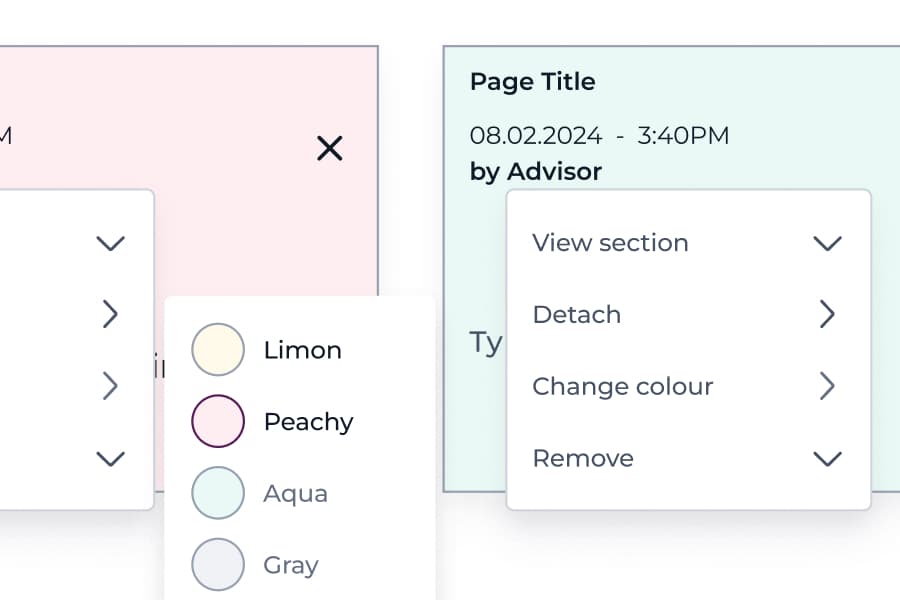
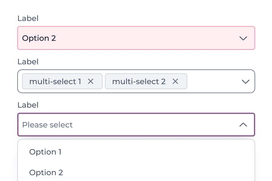
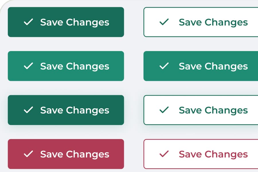
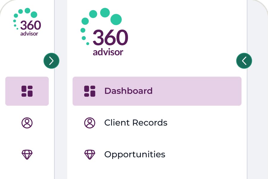
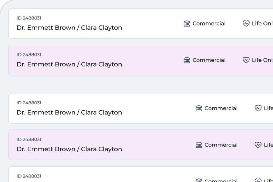
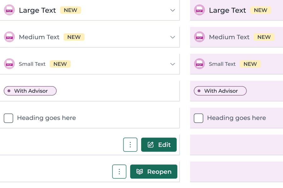
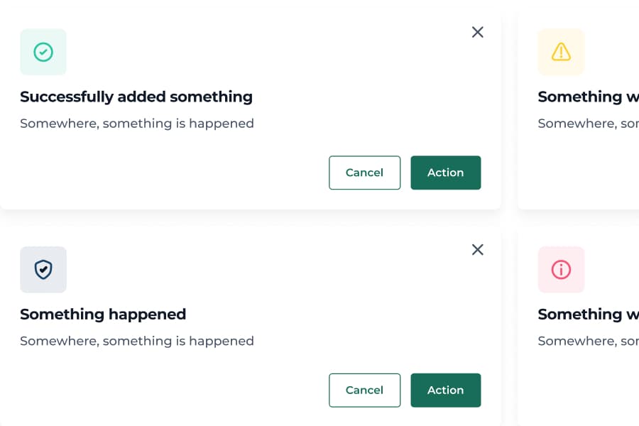
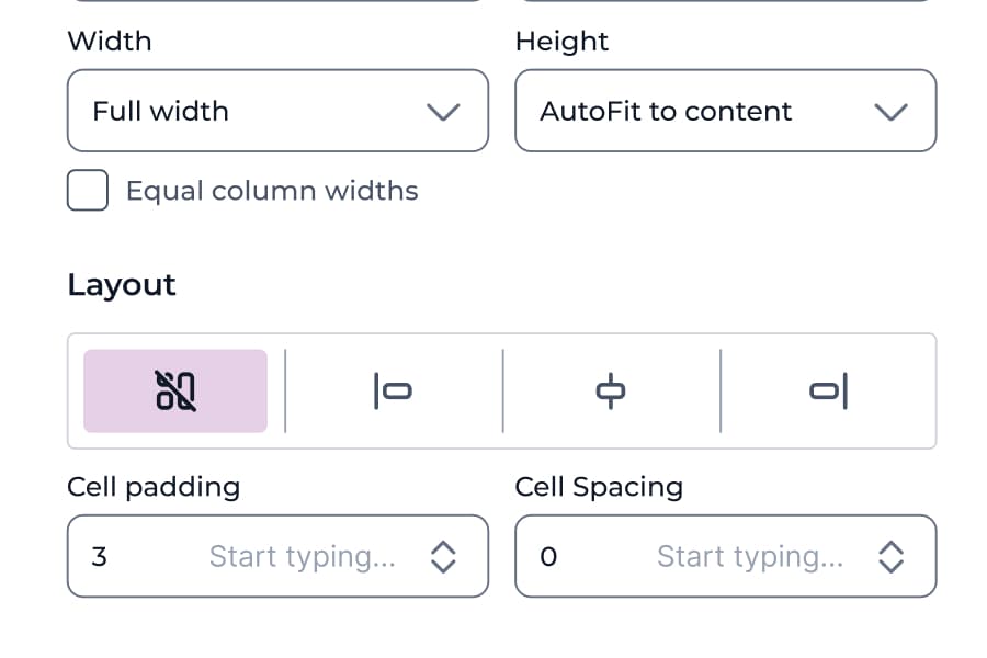
Screenshots from the production Hi-Fi UI Library: 38 pages of foundations, components, and patterns.
Component Highlights
These components were designed around the needs of financial advisory workflows, including compliance flags, dense data tables and time-sensitive information.
One icon set, categorised around what advisers actually do.
I used Heroicons rather than drawing my own, then organised the set by adviser task: actions, client statuses, document types, compliance indicators. The work was in the mapping, not the drawing. An adviser looking for a compliance flag finds it where compliance things live.
Every data entry field follows the same rules, so advisers never re-learn a form.
Specialised numeric inputs, conditional toggles, and multi-field groups built for high-density asset data, prioritising accuracy and speed over visual minimalism, because advisers enter 30+ fields per client session.
Every chart follows the same rules, so advisers read any report instantly.
Modular chart widgets, progress arcs and KPI nodes, all variable-driven and recomposable, which is why a new report never needs a new component.
Documentation
Built to be picked up
A component library is only useful if someone can build from it without having to ask me what I meant. I documented the library the same way I designed it: following strict naming conventions, drawing every state rather than describing it, specifying responsive behaviour per component, and noting when to use a pattern and when not to.
That is the part that lasts. Anyone opening the file can see the reasoning behind a component, not just its appearance.
Key Outcomes
A shared foundation for new product work
38-page library · 20+ component sets
More consistent patterns across the product
Shared components · reusable patterns
A system designed to grow with the product
Built for ongoing product work