
360 Lifecycle: Brand Refresh
Refreshing the 360 Lifecycle identity to support a growing financial platform.
Role
UI/UX Designer
Duration
8 Months
Platform
Web & Mobile
Project Overview
The Challenge
360 Lifecycle had grown from a single product into a broader financial platform, but its visual identity had not kept pace. The existing identity needed clearer rules for use across a wider range of products and materials.
I refreshed and extended the existing identity across product, web, marketing and physical materials. The aim was to make the visual language more consistent without replacing what was already familiar.
Foundation
THE PROBLEM
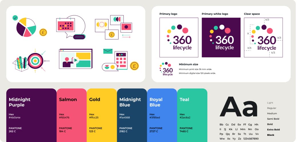
The existing identity had a wordmark and a core blue, but limited guidance for smaller formats, colour use, typography or graphic applications.
THE DECISION
I extended the existing mark into a set of practical formats and organised colour, typography and illustration into reusable visual rules.
THE OUTCOME
The refreshed foundation provided clearer guidance for digital and physical use while keeping the existing brand recognisable.
Digital
THE PROBLEM
The product and website had grown screen by screen, so spacing, typography and component styles were not always consistent.
THE DECISION
I applied the refreshed visual language through reusable tokens, patterns and components, starting with 12 priority screens rather than changing every screen at once.
THE OUTCOME
The 12 priority screens used the same visual rules, supported by 48 reusable components and shared tokens.
Beyond the Screen
THE PROBLEM
Campaigns, event materials and physical collateral did not yet share the same visual rules as the product.
THE DECISION
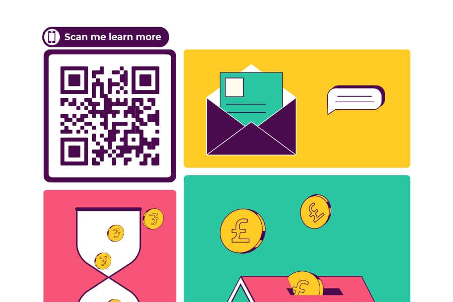
I extended the refreshed identity into templates for presentations, social assets, events and print. The same colour, typography and graphic rules could be reused across formats.
THE OUTCOME
The toolkit covered 8 collateral categories, giving the team reusable starting points for new materials.


Key Outcomes
48 reusable components supporting the refreshed digital identity
SHARED TOKENS · REUSABLE PATTERNS
12 priority screens updated with consistent visual rules
PRODUCT · WEB · MOBILE
Brand toolkit covering 8 collateral categories
SOCIAL · EVENTS · PRESENTATIONS · PRINT